Case study
A budget that fills itself in
BudgetlyPersonal budgeting app
A personal finance app that turns receipts and card activity into a monthly budget — every ringgit assigned to a category, with spending tracked against it.
Field
Personal finance
Scope
UX/UI design
Platform
Mobile app
Currency
Malaysian ringgit (RM)
The challenge
Budgeting apps fail at the same step: people stop logging expenses after the first week. Without the data, the budget turns into a number nobody looks at.
Our approach
We made recording an expense the easiest thing in the app, and built the budget around assigning money before it's spent, not explaining it afterwards.
Scan instead of type
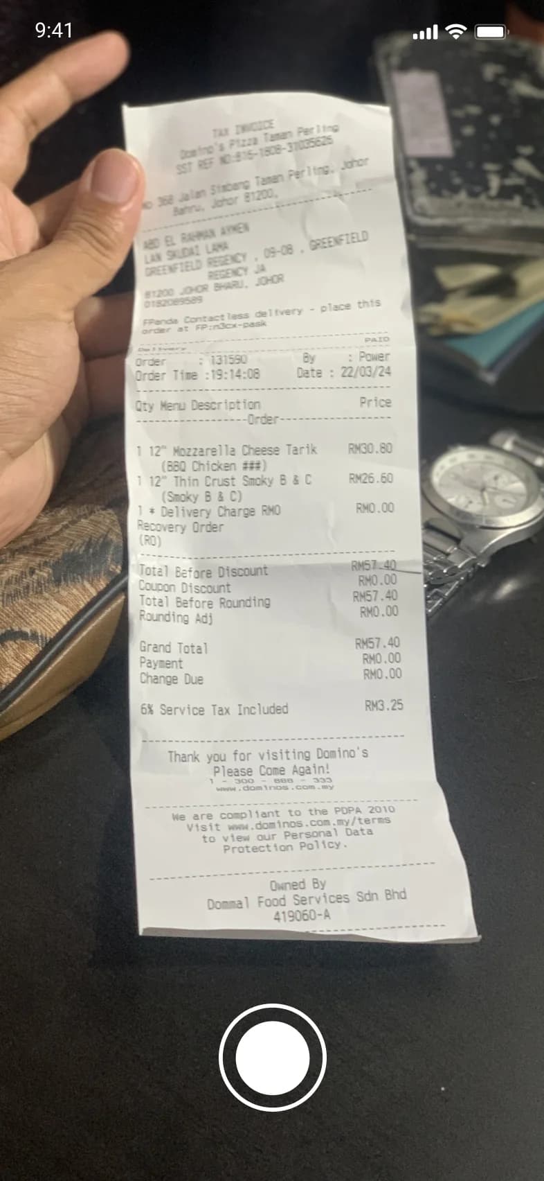
The scan button sits in the middle of the navigation; a photo of a receipt starts a new expense.
Every ringgit assigned
Income is assigned to bills, needs and wants up front, with each category showing what's still available.
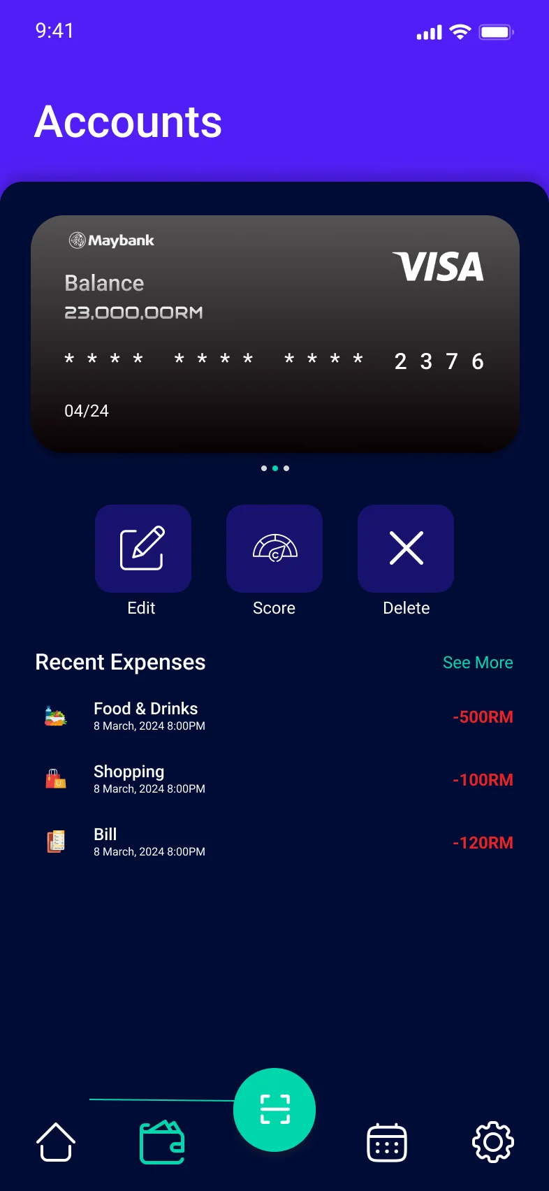
Accounts in one place
Cards, savings, and loans sit side by side, each with its own recent expenses.
Experience direction
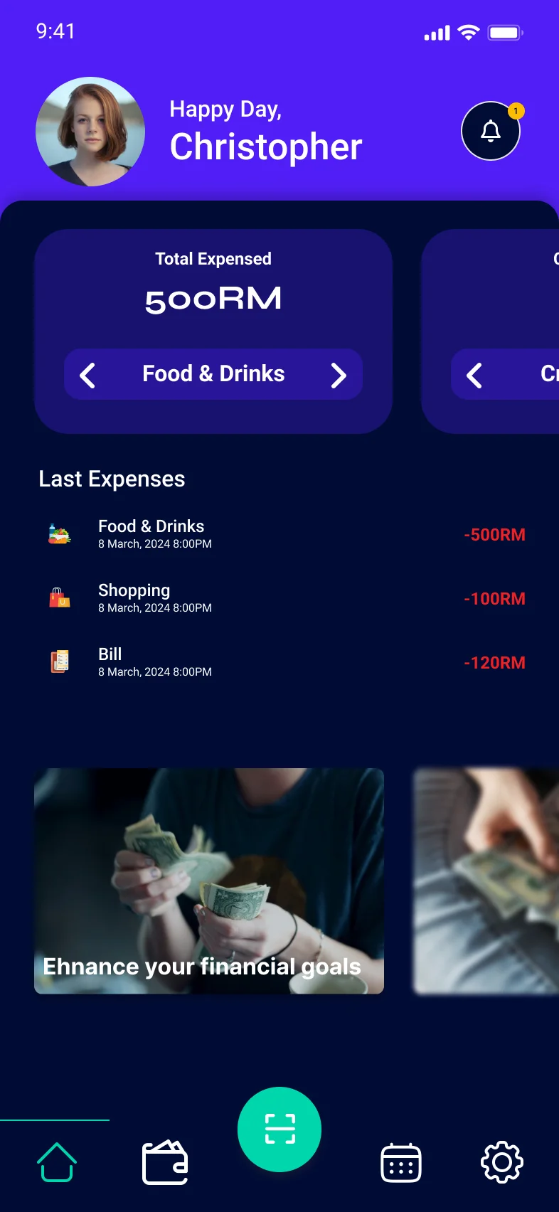
Spending at a glance
Home opens on the month's total by category and the latest expenses.
Progress, not spreadsheets
Statistics show each category as a bar filling against its limit.
Goals you can see
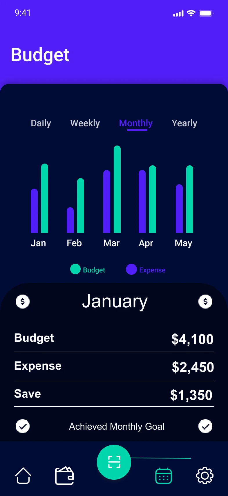
The monthly view compares budget, expense and savings, and marks when a goal is met.
Product screens
Home, receipt scanning, accounts and the monthly budget, from the Budgetly app.
Design system
A deep violet base with a bright teal for actions and progress, so the scan button and filled budgets are the first things you see.
Outcome
The design keeps expense tracking going past the first week: scanning a receipt takes a single tap, every category shows what's left, and the monthly view shows whether the plan worked.
Receipt scanning from any screen
Category budgets with money left to spend
Monthly budget vs. expense at a glance
Related project